
NetOrca
Giving NetOrca the digital presence to match its product, clarity, credibility and conversion at every touchpoint
The Challenge
With two offerings, one brand and a digital presence that wasn't keeping up, NetOrca operates across two distinct but connected entities: NetOrca, the automation product, and NetAutomate, the consultancy behind it. The challenge was to bring both under a single, coherent digital experience without muddying the message for either audience. Alongside this, NetOrca needed a standalone logo for its new AI add-on, the NetOrca Pack that could sit within the existing brand family while holding its own as a distinct mark. The wider brief demanded clarity, credibility and conversion across every touchpoint.
.png)
The Approach
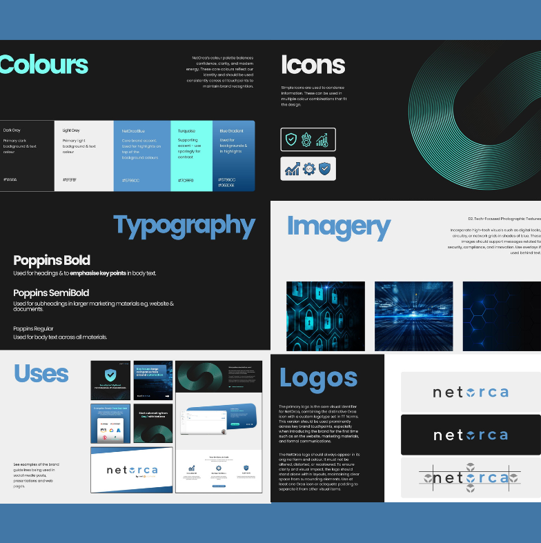
Unified experience, distinct identity, our strategy centred on two parallel workstreams: building a unified website and crafting a brand extension for the NetOrca Pack each informed by the same core principle of clarity and cohesion. Website - We simplified the user journey and refined the messaging architecture to guide visitors effortlessly toward the right solution. Product-led storytelling was blended with consultancy-driven credibility, wrapping everything in NetOrca's bold existing colour palette to preserve the trust they'd already built. NetOrca Pack Logo - We extracted the brand's core design elements — rounded geometry, soft line weights and signature blue then built a new symbol: three stylised orca fins within a hexagonal frame, referencing modularity, technology and structured intelligence. A cohesive extension that feels connected to the parent brand while standing confidently alone. Every word was crafted to lead with NetOrca's boldest proof points; real performance data surfaced front and centre to make enterprise-ready advantages unmistakable to the right buyers. From information architecture to visual systems, every decision was made to give NetOrca a platform that can grow alongside the business, not one it'll outgrow in a year.
The Results
A digital footprint that matches the product's ambition The new website supercharged NetOrca's message and digital presence. With clear positioning and unified design, the platform now leads with bold, data-backed claims drawn directly from the product's real-world performance. A unified website bringing NetOrca (product) and NetAutomate (consultancy) under one coherent digital experience for the first time. A new NetOrca Pack logo, with three orca fins in a hexagonal frame that extends the brand identity to the AI add-on while standing as a mark in its own right. Elevated credibility and enterprise-ready positioning, with a site structured to support fast visitor conversion into demos and discovery calls.
.png)
Working with Hey Digital on the rebrand of NetOrca.io and NetAutomate.org delivered real value for our business. They quickly understood our vision, clarified our positioning, and translated complex technical offerings into a clean, compelling brand identity. Even when we hit challenges or needed rework, they took our feedback on board, listened carefully to our perspectives, and iterated thoughtfully until everything felt right. The process was seamless and collaborative, and the end result is two brands that clearly communicate who we are and where we’re going.
Ready to
make it happen?
Your next creative growth partner. We act as an extension of your team, not an agency on the side.